Vice News Tonight
When people hear VICE, they think weird, fringe type stories, because these are what get shared and consumed the most. We needed to inject some extra credibility into Vice's more traditional reporting format.
News is not at the top of your binge list. But abstaining from it just makes you ignorant, and we are all tired of ignorance. This campaign presents new avenues to connect with the news, and follow what you care about.
VICE Now - AR news app
This app presents a new way to take in the news. You pick a story to explore, point your phone to a blank wall, and lay out all the elements of that story onto your wall.
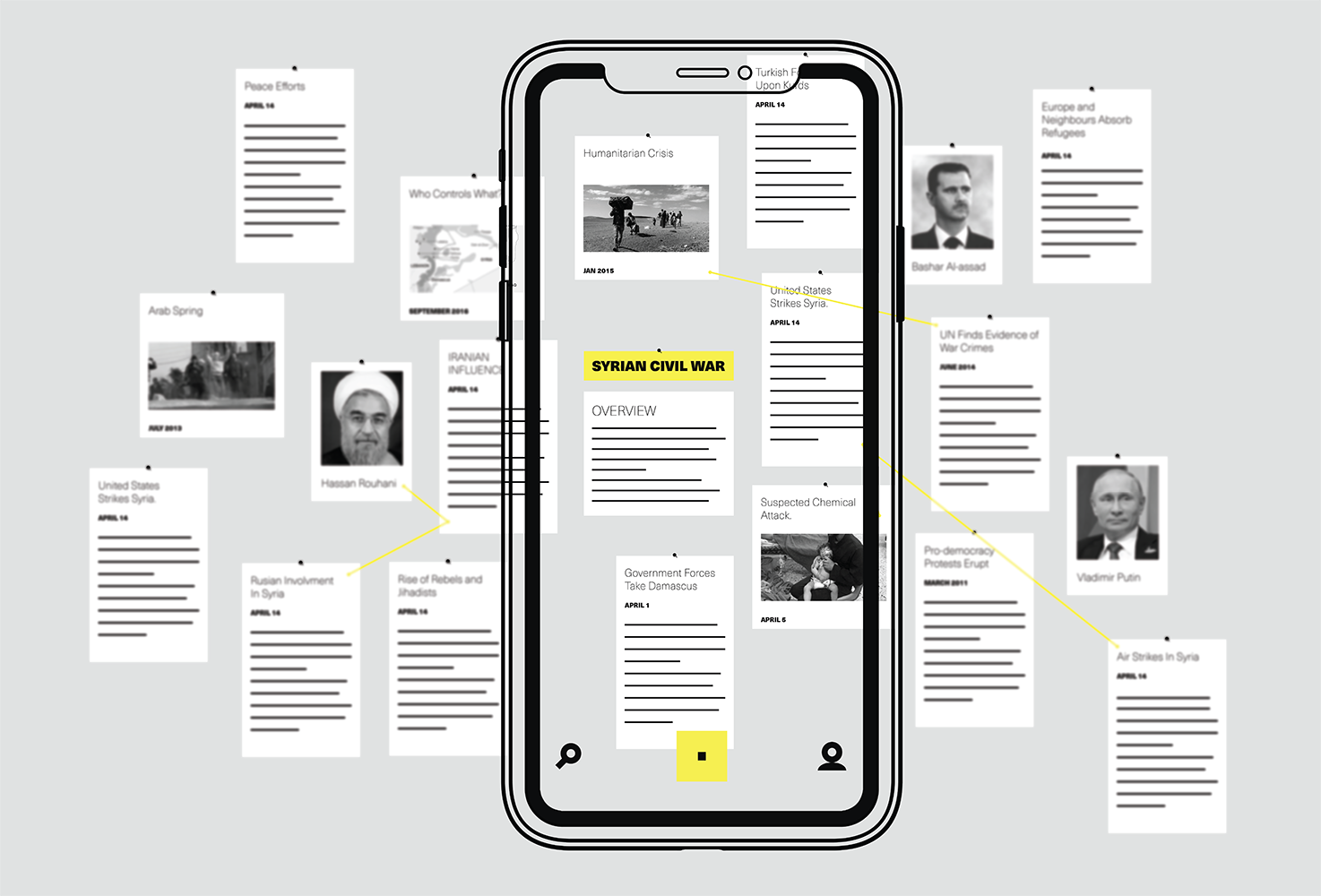
How it works
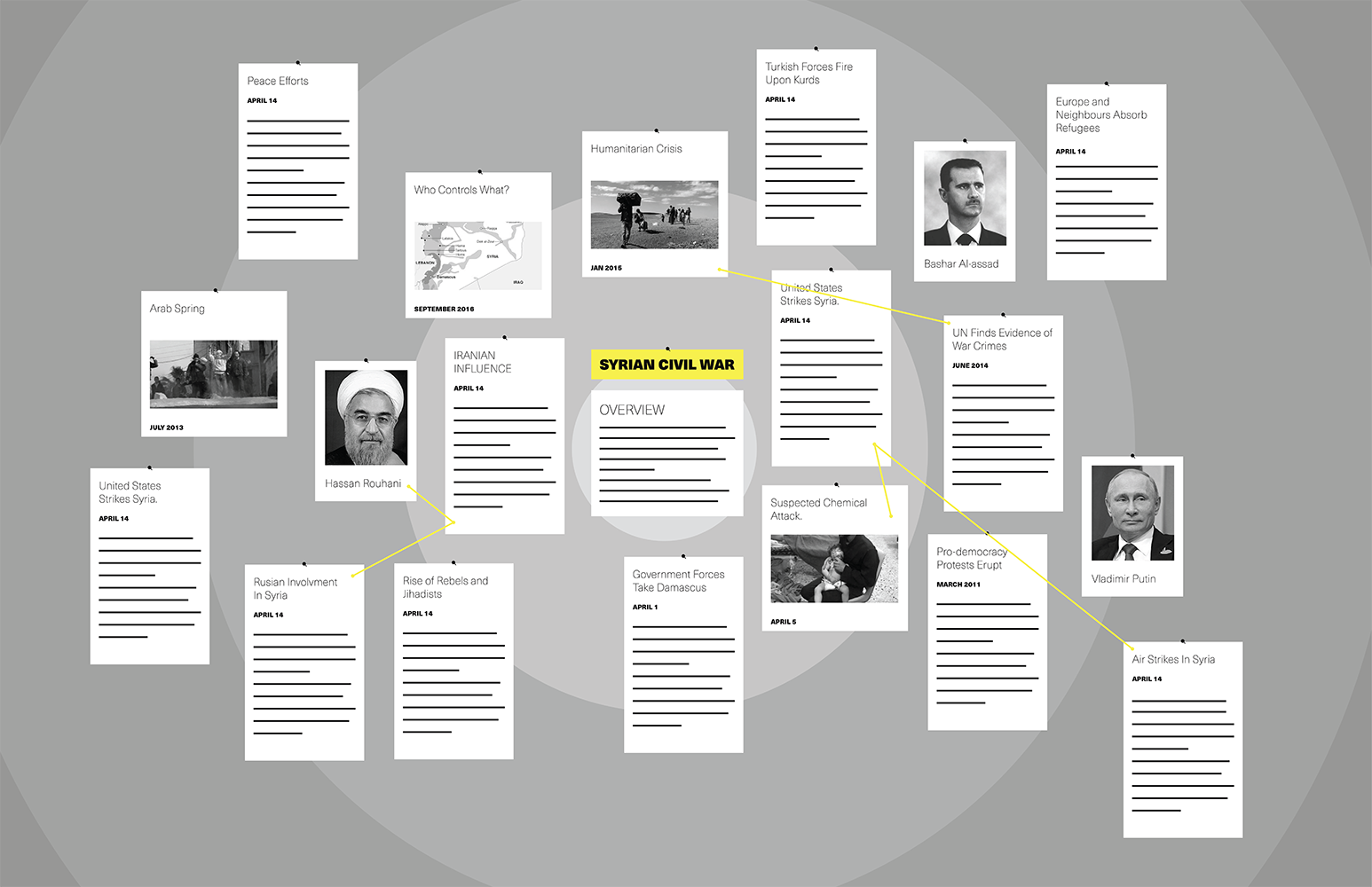
The app lays out each element on a bullseye map, shaped to match your wall. The stories are places from the center out in this order: Overview and title, Recent updates, Major stories, Key figures, Relating events, and Older backstory.
How to use it
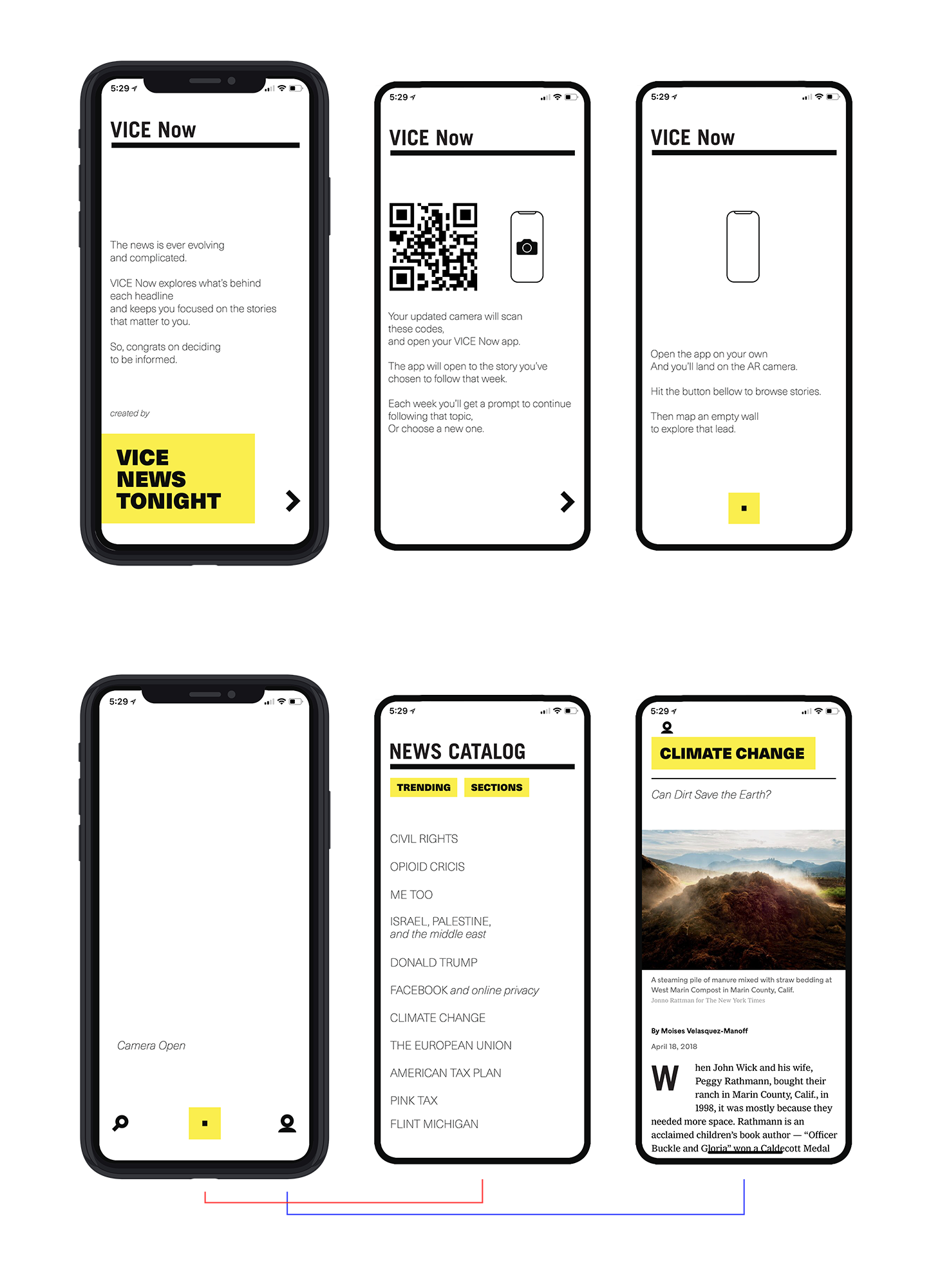
Here is the welcoming screen to VICE Now. Each frame explains the features in the app.
First frame here is the AR Camera view. Middle is the catalogue of stories to choose from. Last is your personal topic to follow.
Bringing Back the QR Code
IOS11 camera updates have brought life back to this little guy. Open your camera, point at a code, and a drop down window apears to re-directs you to the app.
Each time you scan a code, it opens the to the story you chose to follow, presenting either an update on this topic, or an older piece for you to explore (because not all topics have constant updates).
Out of Home
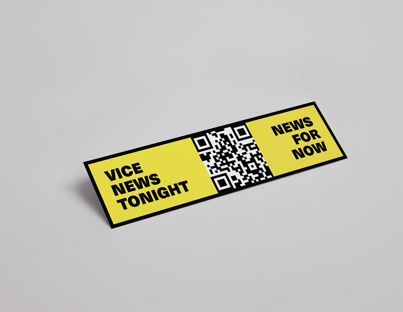
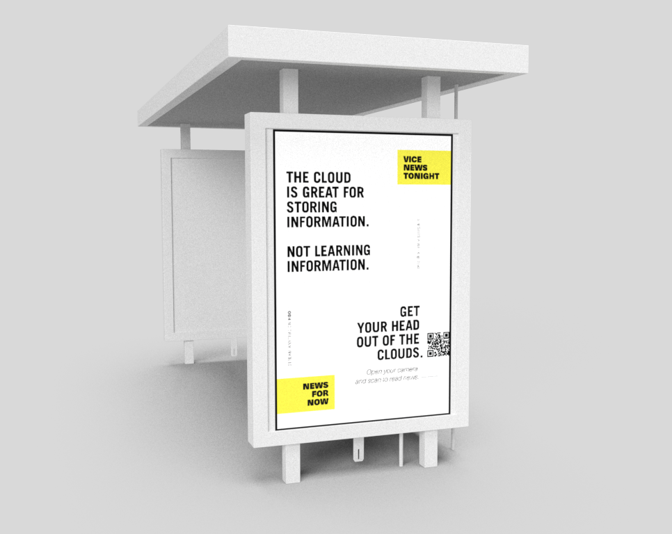
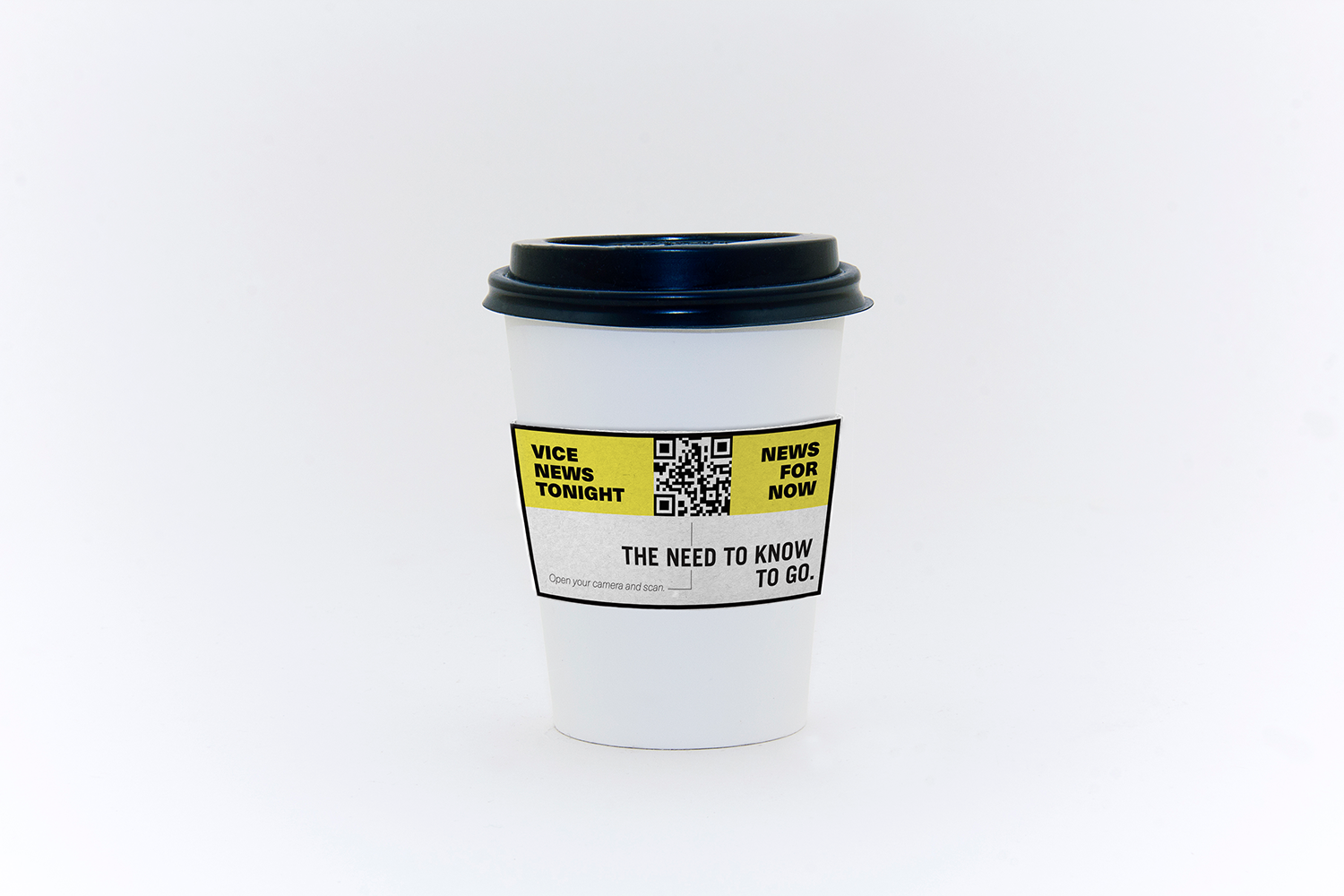
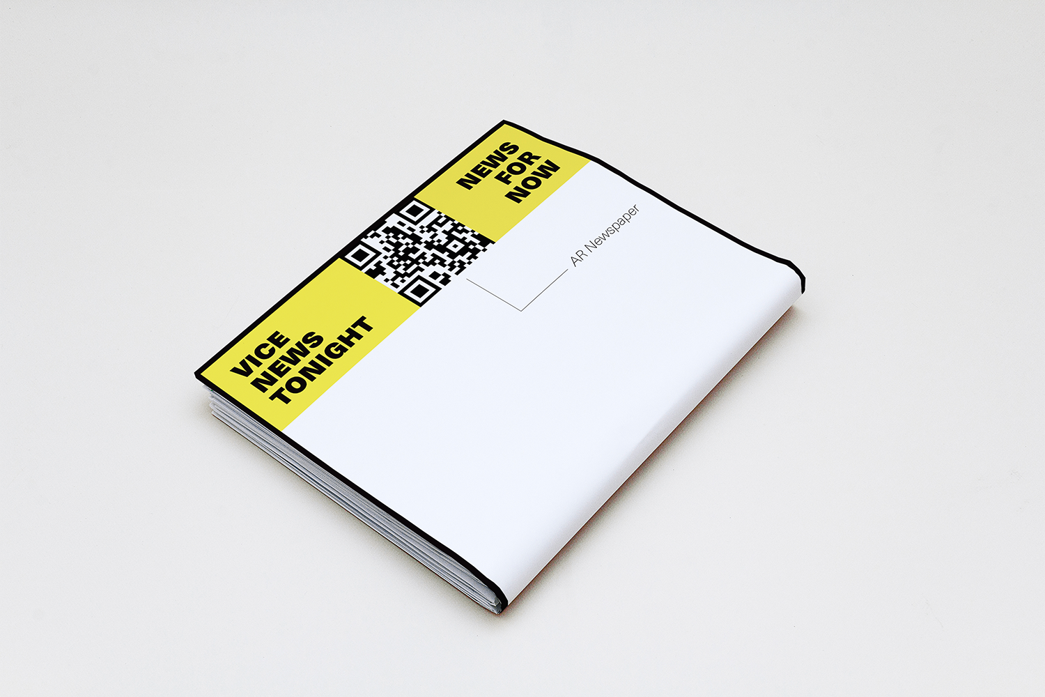
When engaging with thee executions, our audience is usually in a moment of rest; waiting for the next thing to happen. The bus shelter gives them something productive to do while waiting on their ride. The coffee sleeve is used on the commute or when they first arrive at work. The newspaper gives a unique experience in the app after passing by a newsstand.
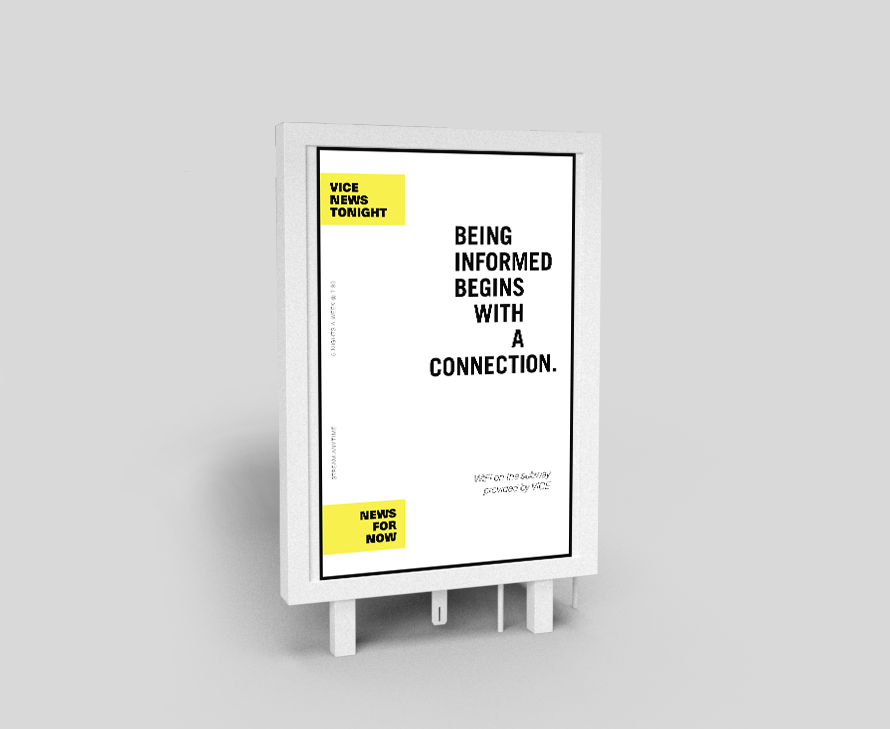
Subway Wifi
Here we outfit subway cars with WIFI routers, providing free internet for riders, after watching a short promo for tonight's lead story.
Here is the process in action, on your smartphone.
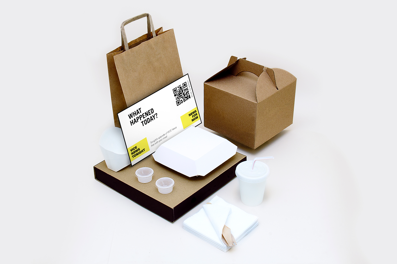
Uber Eats Promo
To lead people to our nightly news show, we partner with Uber Eats to present dinner and a show. When ordering, consumers get a card and code to watch tonight's episode for free.
collaborators
Olivia Bono - Copywriter
Work


