Glossier Hair
Glossier, a brand that has long stood for femininity and womens' rights, presents a new product line of gender neutral hair dye. Hair dye for Humans encourages everyone to style themselves in their own image.
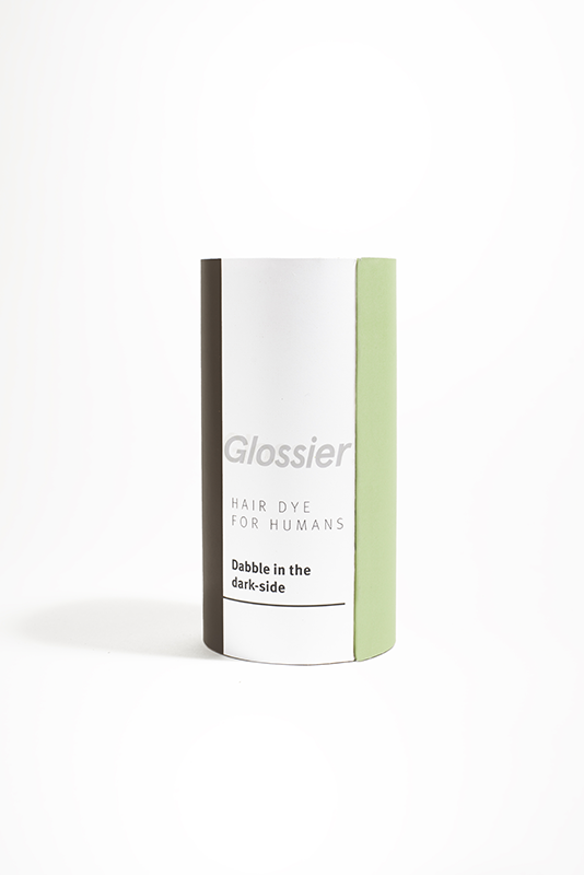
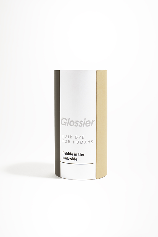
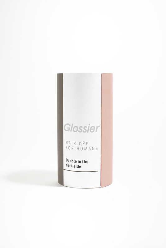
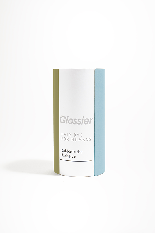
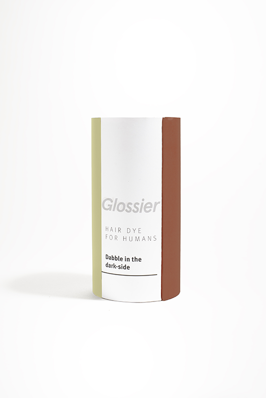
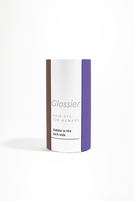


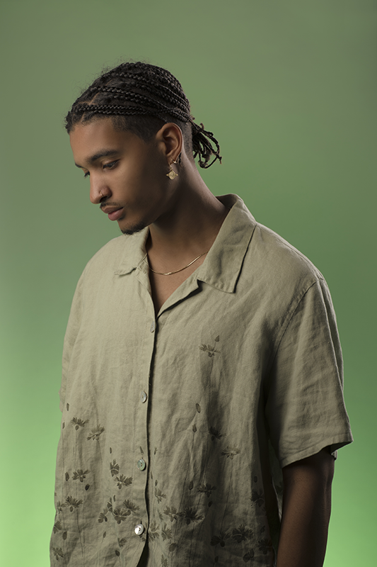
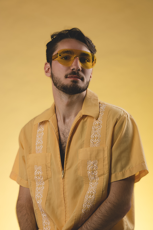
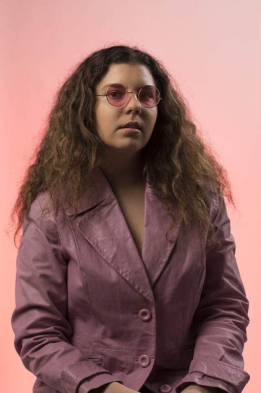
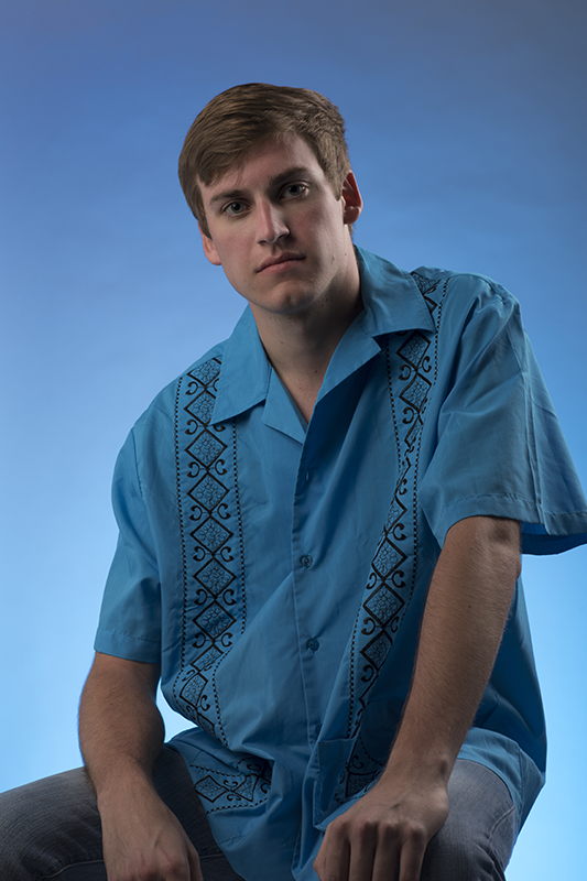
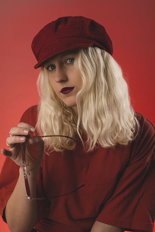
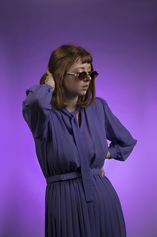


This idea began when my male roommate comes home to dye his hair with a product labeled "for beautiful brunettes." This box, along with the rest of the hair dye aisle, exposed a major whole in the market; no hair dye speaks to men.
Hair dye for Humans
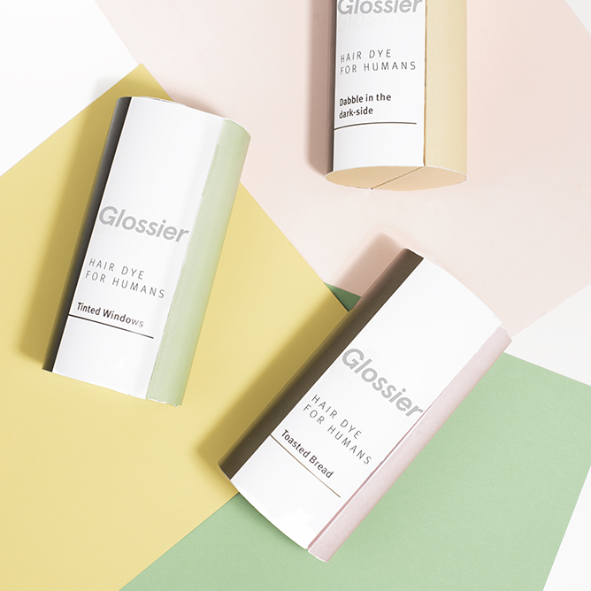
Each hair color has been meticulously paired with a complementary color, creating a bright and vibrant design language. This also seeks to elevate the power of some of these natural colors, when paired and styled correctly.
Package Design
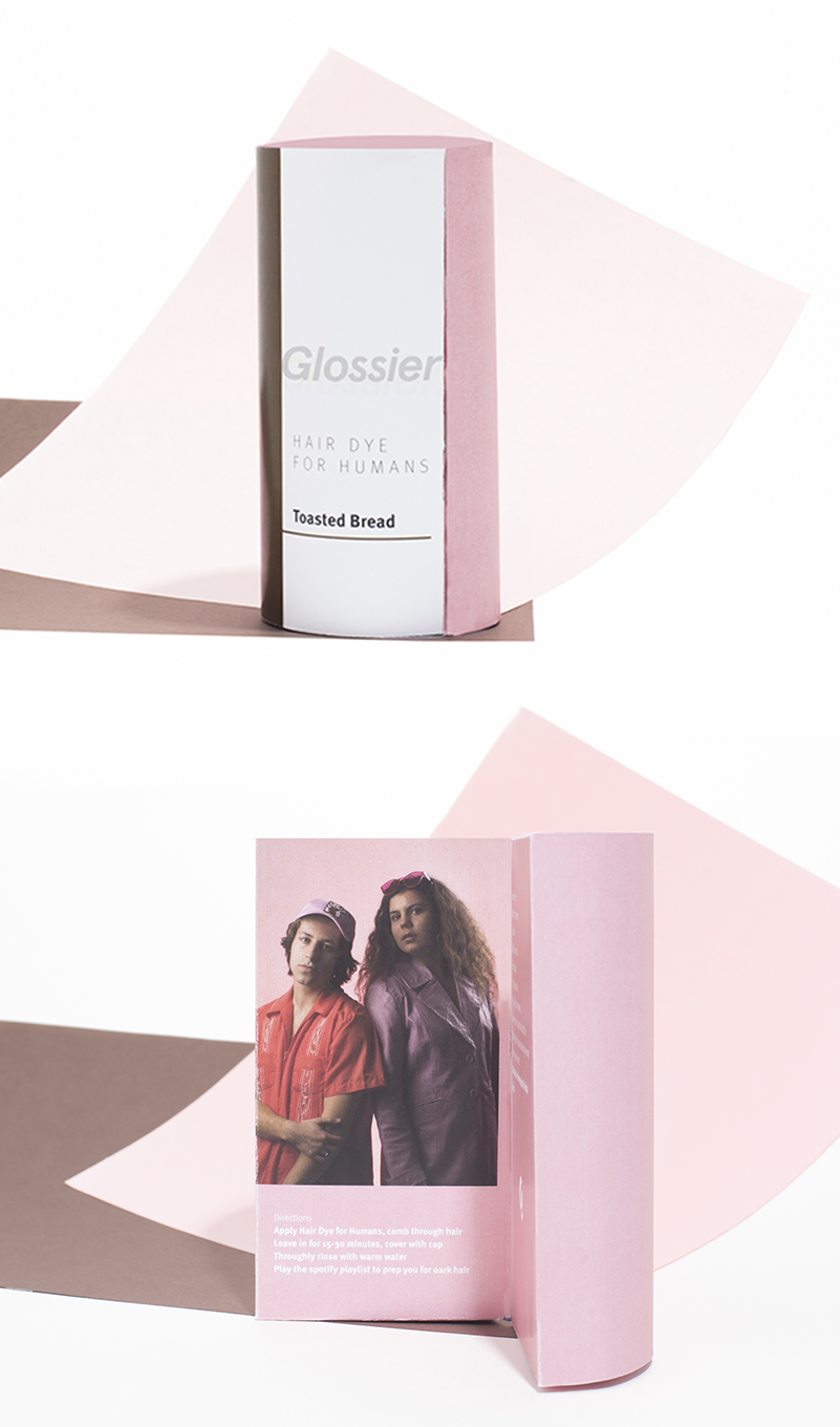
We created a package meant to immediately stand out in the hair dye isle. The package is cylindrical, composed of two halves that open to reveal a full hair image, as well as details about the product and line. The package is meant to be interactive, inviting in you open and explore.
Why no hair on the outside? Because it doesn't matter! Our research revealed that it is nearly impossible to match your hair to the hair pictured on many box exteriors, so we simplify the outside by only showing the solid block of color you are aiming for.
Inside the half cylinders, costumers find hair dye and developer, a mixing bottle, application comb, a pair of gloves, and a Spotify playlist code.
Hair Color Playlists
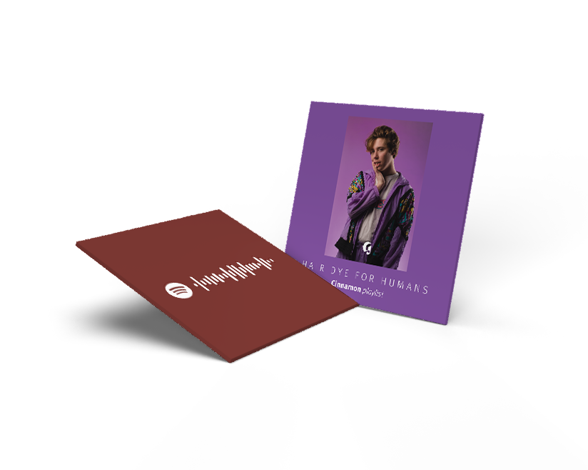
For each color, we create a corresponding Spotify playlist, meant to jam out to while you let your hair dye sink in and prepare for your new color. These are for placement inside the package, presenting the hair dye color and Spotify code on the back.
Webpage
This page has two functions: the first, shown below, serves as a manifesto behind this product line. The page explains the reasons behind Hair Dye for Humans, as well as a quick jump to the individual products.
In-store Display
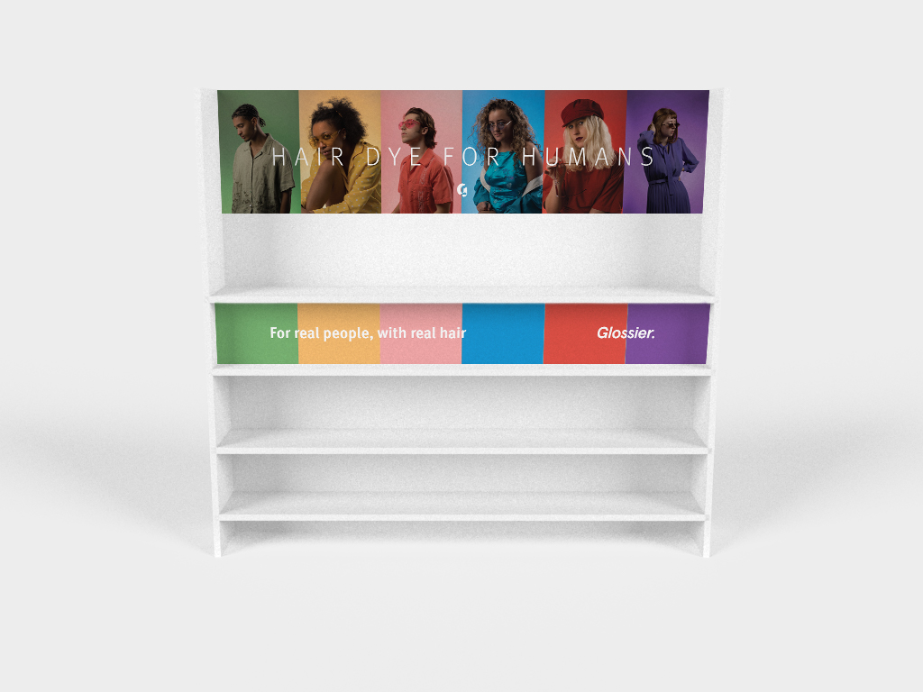
This end cap display works to further disrupt the traditional look and feel of a hair dye isle.
collaborators
Ymke Franssen - Photography and Design
Olivia Bono - Copywriting
Work


